

Brand Design
Huckberry Farm
Huckberry Farm
One Brand + Web Week. A full visual identity, voice system, three-page Squarespace site, and a Phase 2 roadmap for a forty-acre working farm opening as a curated gathering space.
One Brand + Web Week. A full visual identity, voice system, three-page Squarespace site, and a Phase 2 roadmap for a forty-acre working farm opening as a curated gathering space.
Year
2026
Year
2026
Year
2026
Client
Huckberry Farm
Client
Huckberry Farm
Client
Huckberry Farm
Industry
Custom Events
Industry
Custom Events
Industry
Custom Events
Project Duration
1 Week
Project Duration
1 Week
Project Duration
1 Week
Intro
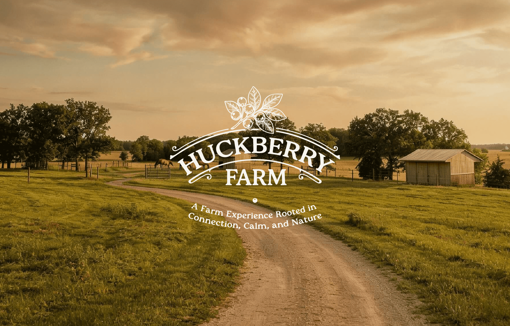
Huckberry Farm is a forty-acre working homestead and horse farm in rural Minnesota, opening this season as a curated gathering space for ten-to-fifty-person retreats, leadership offsites, chef-led dinners, faith and church retreats, family milestones, seasonal farm gatherings, and VIP days.
The business had been operating as a horse-boarding and equine-lessons property for years. With the new offer, the owner needed a brand and Phase 1 website that could carry a 10–15 event season running May through November — without turning the farm into the loud, party-driven venue.
A Place That Already Knew What It Was
There was no existing brand. No website. No visual system. The brief was to grow demand and qualified inquiries for a launch season — without diluting the property’s peace and presence in the process.
I came in to translate what the place already was — quiet, hosted, intentional — into a brand and Phase 1 website that could carry it from first inquiry through booked event.

Translation, Not Invention
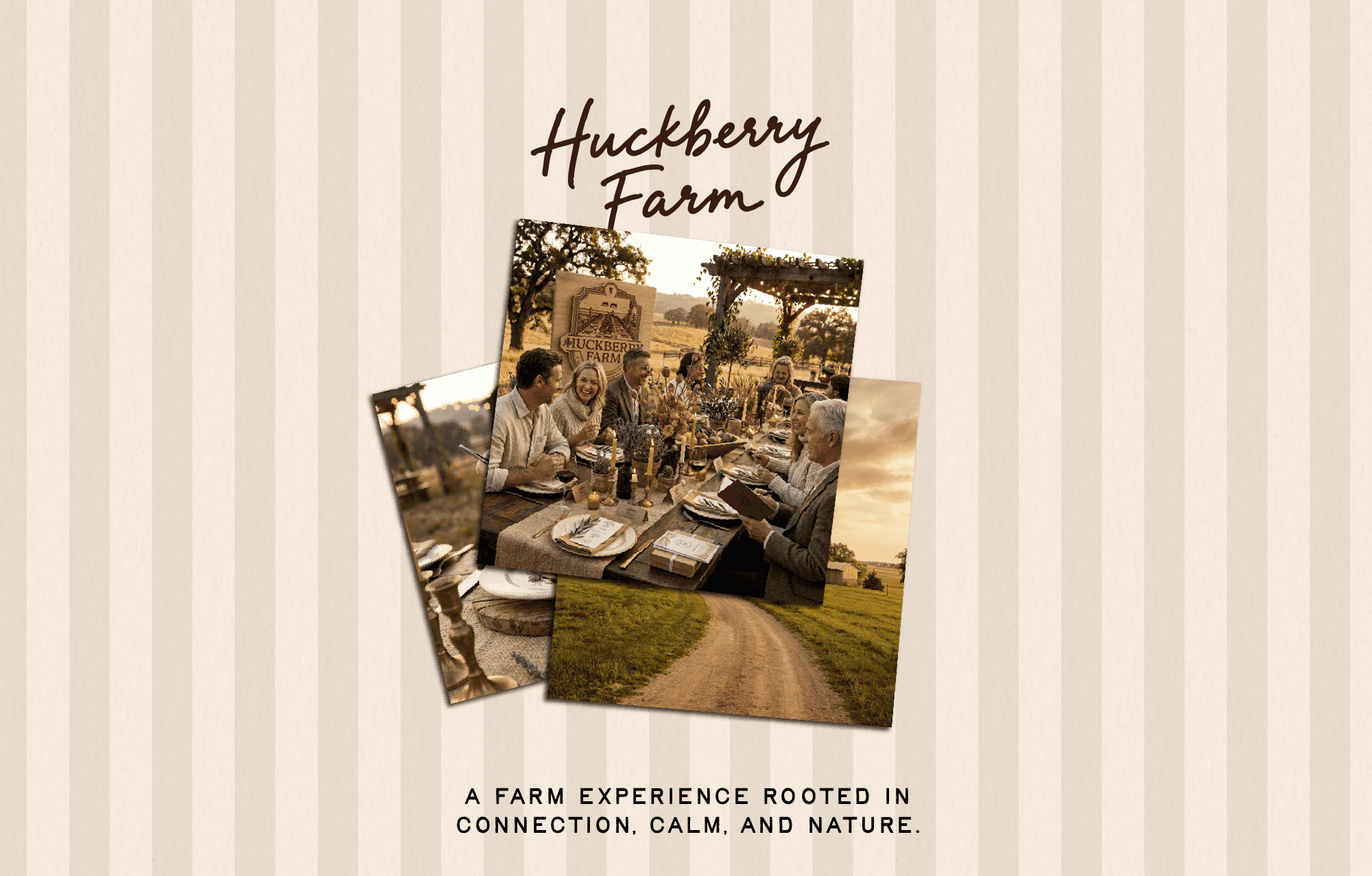
I joined Huckberry Farm as the brand and web designer for a Brand + Web Week — a full visual identity, voice and language system, and a launched Phase 1 Framer site, delivered in just one week.
The approach was built on three principles:
Stillness as a Signal
The core product is calm. If the brand didn’t feel like an exhale on first glance, it was off-promise. Generous space, type that sat down rather than shouted, photography with room to breathe.
Warm Earth, Not Rustic Cliché
I deliberately stepped away from the shiplap-and-mason-jar world. The palette was pulled directly from the land — tans, warm neutrals, a deep field green, a soft barn clay — verified against the property at golden hour.
Hosted, Not Rented
The business model is curation, not rental. The brand had to feel personally hosted — like arriving at a friend’s property. Hand-drawn accents used with restraint. First-person voice. Photography of place over crowd.

Scope & Key Deliverables
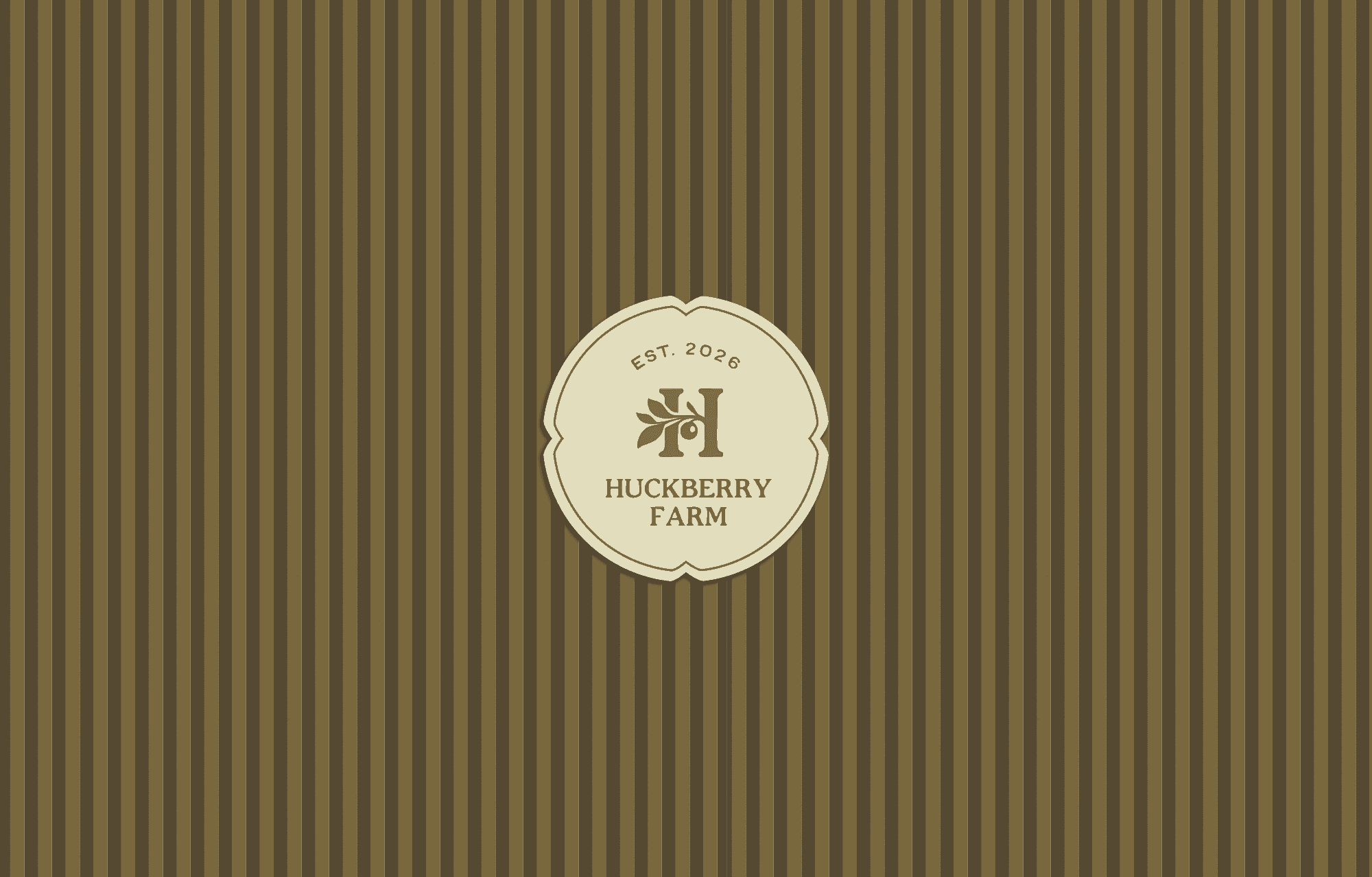
Wordmark & Logo System
Twelve-Color Palette
Type System (Anchor Serif + Hand-Script)
Hand-Drawn Accent & Illustration Set
Photography Direction
Voice, Language, and Headline System
Phase 1 Framer Build (Home, Inquire)
Inquiry Form with Smart Qualifying Fields
Phase 2 Roadmap (About, Partners, Notes from the Farm)

Impact & Outcomes
Full launch metrics will be added once the May–November season is behind us.
3
Pilot Events In The Making
2
Website Phases
1
Epic Launch
Why This Work Matters
What I’m most proud of is how cleanly the brand holds its line. The wordmark is neutral enough to anchor future offer lines without a rebrand. The palette photographs well at golden hour and never fights the actual property. The website earns the inquiry, then gets out of the way. Every pillar (stillness, warm earth, hosted, place-led) does measurable work in the system — they’re design constraints, not adjectives.
Latest Projects
Brand Design
Huckberry Farm
Huckberry Farm
One Brand + Web Week. A full visual identity, voice system, three-page Squarespace site, and a Phase 2 roadmap for a forty-acre working farm opening as a curated gathering space.
One Brand + Web Week. A full visual identity, voice system, three-page Squarespace site, and a Phase 2 roadmap for a forty-acre working farm opening as a curated gathering space.
Year
2026
Year
2026
Year
2026
Client
Huckberry Farm
Client
Huckberry Farm
Client
Huckberry Farm
Industry
Custom Events
Industry
Custom Events
Industry
Custom Events
Project Duration
1 Week
Project Duration
1 Week
Project Duration
1 Week
Intro
Huckberry Farm is a forty-acre working homestead and horse farm in rural Minnesota, opening this season as a curated gathering space for ten-to-fifty-person retreats, leadership offsites, chef-led dinners, faith and church retreats, family milestones, seasonal farm gatherings, and VIP days.
The business had been operating as a horse-boarding and equine-lessons property for years. With the new offer, the owner needed a brand and Phase 1 website that could carry a 10–15 event season running May through November — without turning the farm into the loud, party-driven venue.
A Place That Already Knew What It Was
There was no existing brand. No website. No visual system. The brief was to grow demand and qualified inquiries for a launch season — without diluting the property’s peace and presence in the process.
I came in to translate what the place already was — quiet, hosted, intentional — into a brand and Phase 1 website that could carry it from first inquiry through booked event.
Translation, Not Invention
I joined Huckberry Farm as the brand and web designer for a Brand + Web Week — a full visual identity, voice and language system, and a launched Phase 1 Framer site, delivered in just one week.
The approach was built on three principles:
Stillness as a Signal
The core product is calm. If the brand didn’t feel like an exhale on first glance, it was off-promise. Generous space, type that sat down rather than shouted, photography with room to breathe.
Warm Earth, Not Rustic Cliché
I deliberately stepped away from the shiplap-and-mason-jar world. The palette was pulled directly from the land — tans, warm neutrals, a deep field green, a soft barn clay — verified against the property at golden hour.
Hosted, Not Rented
The business model is curation, not rental. The brand had to feel personally hosted — like arriving at a friend’s property. Hand-drawn accents used with restraint. First-person voice. Photography of place over crowd.
Scope & Key Deliverables
Wordmark & Logo System
Twelve-Color Palette
Type System (Anchor Serif + Hand-Script)
Hand-Drawn Accent & Illustration Set
Photography Direction
Voice, Language, and Headline System
Phase 1 Framer Build (Home, Inquire)
Inquiry Form with Smart Qualifying Fields
Phase 2 Roadmap (About, Partners, Notes from the Farm)
Impact & Outcomes
Full launch metrics will be added once the May–November season is behind us.
3
Pilot Events In The Making
2
Website Phases
1
Epic Launch
Why This Work Matters
What I’m most proud of is how cleanly the brand holds its line. The wordmark is neutral enough to anchor future offer lines without a rebrand. The palette photographs well at golden hour and never fights the actual property. The website earns the inquiry, then gets out of the way. Every pillar (stillness, warm earth, hosted, place-led) does measurable work in the system — they’re design constraints, not adjectives.