Embedded Design Partner
Property Management SaaS Product
Property Management SaaS Product
Six months embedded. Brand identity, website, web app, mobile app, 750+ book covers, ad and marketing design, sales suport, enterprise design and more.
Six months embedded. Brand identity, website, web app, mobile app, 750+ book covers, ad and marketing design, sales suport, enterprise design and more.
Year
2026
Year
2026
Year
2026
Client
Property Management SaaS Company
Client
Property Management SaaS Company
Client
Property Management SaaS Company
Industry
Real Estate
Industry
Real Estate
Industry
Real Estate
Project Duration
8 Weeks / Ongoing
Project Duration
8 Weeks / Ongoing
Project Duration
8 Weeks / Ongoing
Intro
A property management SaaS company came to me with a product that had grown organically through engineering-led development. The platform handled leasing, operations, financials, communications, and tenant-facing marketing — but lacked a cohesive design system, consistent UI patterns, or a clear information architecture.
The product serves property managers who juggle dozens of buildings, hundreds of units, and thousands of lease details daily. Every workflow — from tracking lease renewals to scheduling maintenance to running financial reports — needed to feel intuitive, fast, and reliable. The existing interface was functional but fragmented: inconsistent layouts, unclear navigation hierarchies, and no scalable component library.

A Complex Product, No Design Foundation
I was brought on as the sole product designer to redesign the platform from the ground up while the product was actively being built — designing ahead of development sprints and collaborating directly with the engineering team.


Designing a System, Not Just Screens
With a product this large and a development team building in parallel, I couldn’t just design pages — I had to create a design system that the engineering team could implement consistently without me reviewing every commit.
Information Architecture First
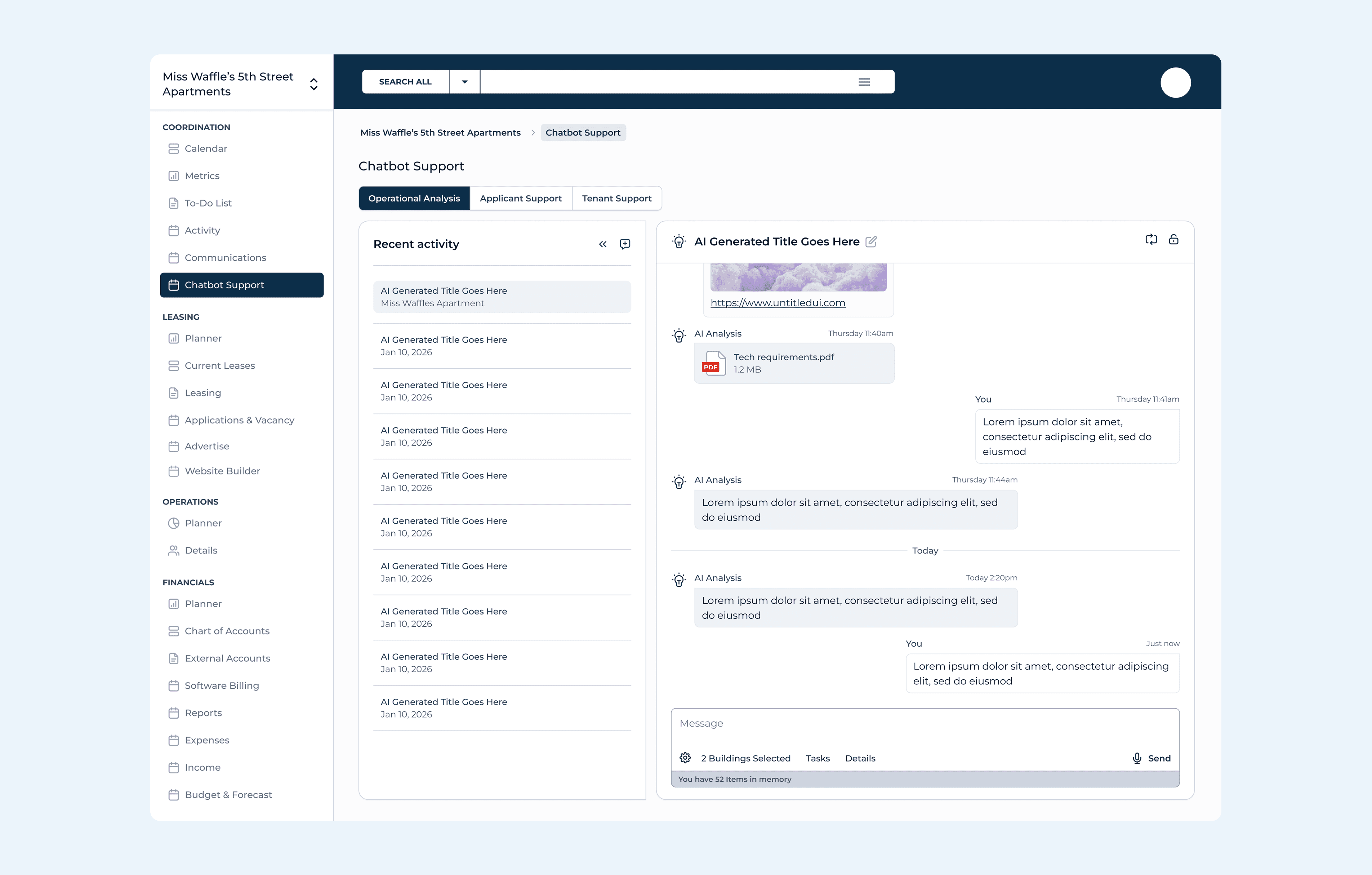
The sidebar navigation organizes the entire platform into four clear domains: Coordination (calendar, metrics, tasks, communications), Leasing (planner, current leases, applications, advertising, website builder), Operations (planner, details), and Financials (accounts, billing, reports, budget & forecast).
Each domain mirrors how property managers actually think about their day.
Component-Driven Design
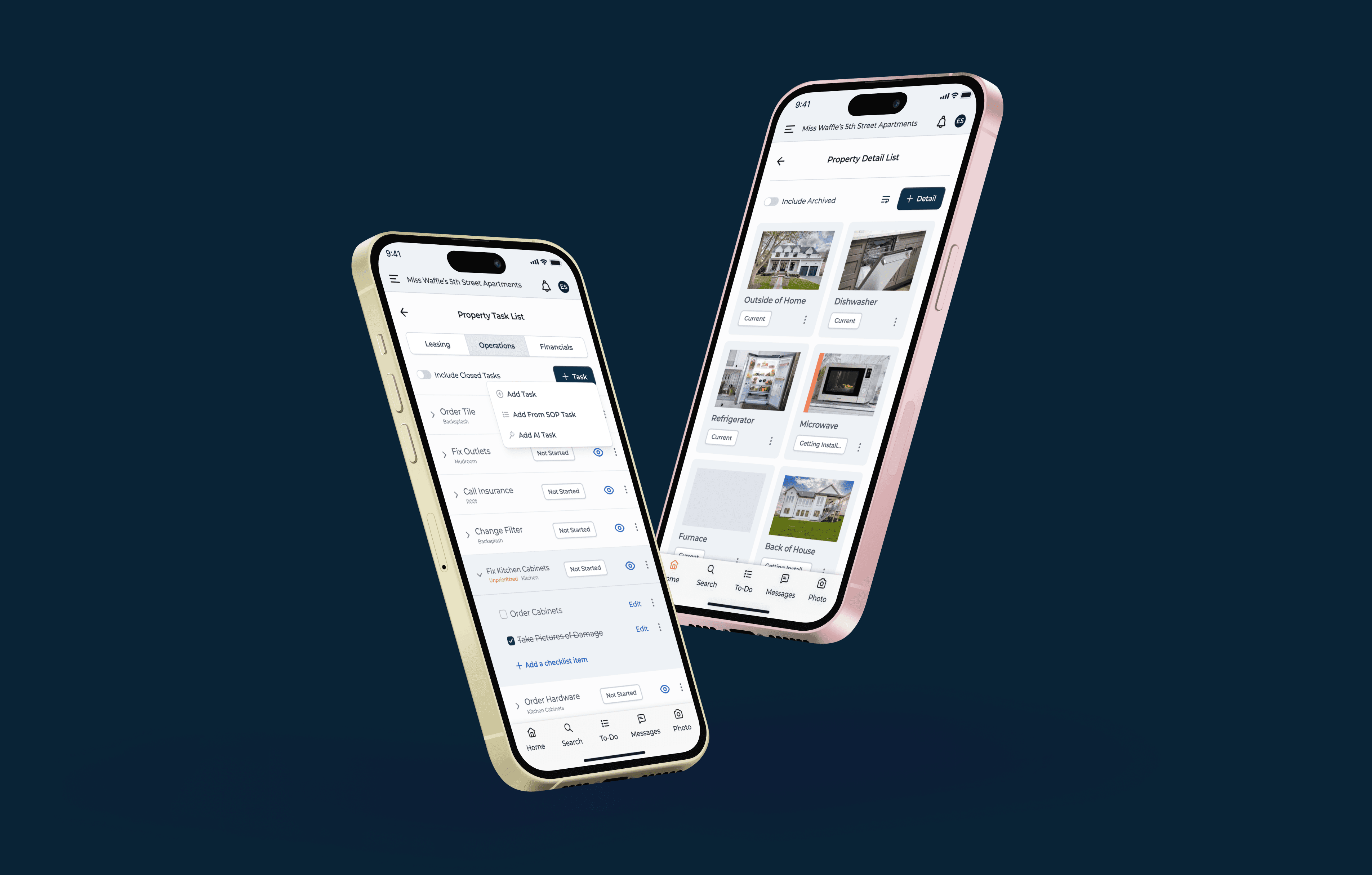
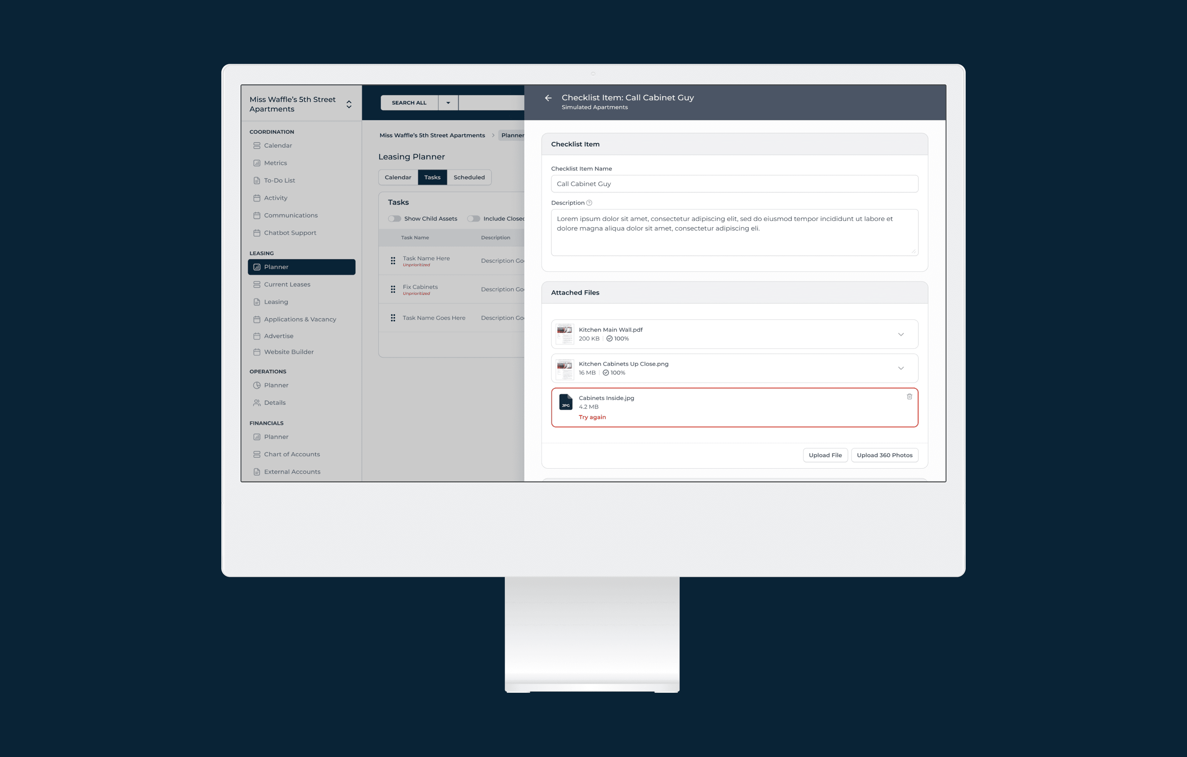
I established reusable patterns for the most common interactions: data tables with sortable columns, status chips, and pagination; 3/4 flyout panels for detail views; full-page modals for complex forms; inline editing for tasks; and a consistent card-based layout for observations, comments, and file attachments.
Each pattern was designed once and applied across every feature area.
Designing Ahead of Development
I worked one to two sprints ahead of the engineering team, delivering dev-ready Figma specs for each feature area before it entered the build queue. This required close collaboration with the product owner to understand priorities, and careful annotation of every screen so developers could move quickly without ambiguity.
What the Product Needed
A unified web app design across 50+ unique screens
A scalable navigation system for multi-property hierarchies
Data-dense table designs with inline editing and nested rows
Calendar, planner, and scheduling views for coordination
AI chatbot interface for operational analysis and tenant support
A tenant-facing marketing website builder
Detail views with observations, documents, and associations
A component-based design system to hand off to engineering
Designing at Scale
Every screen was designed in Figma with developer-ready annotations, consistent spacing tokens, and reusable components. The Figma file is organized by feature area with clear labeling for dev handoff — each page marked with status indicators so the engineering team always knows what’s ready to build.
50+
Unique Screens
3
AI Chat Modes
1
Design System
Why This Work Matters
The work shows range: data-heavy tables, AI interfaces, calendar views, form design, marketing websites, and hierarchical navigation — all within a single, cohesive product. It also shows process: I wasn’t just making things look better, I was establishing patterns, creating reusable components, and building a design foundation that will serve the product long after my engagement.
This is a project still in progress.
Latest Projects

Embedded Design Partner
Property Management SaaS Product
Property Management SaaS Product
Six months embedded. Brand identity, website, web app, mobile app, 750+ book covers, ad and marketing design, sales suport, enterprise design and more.
Six months embedded. Brand identity, website, web app, mobile app, 750+ book covers, ad and marketing design, sales suport, enterprise design and more.
Year
2026
Year
2026
Year
2026
Client
Property Management SaaS Company
Client
Property Management SaaS Company
Client
Property Management SaaS Company
Industry
Real Estate
Industry
Real Estate
Industry
Real Estate
Project Duration
8 Weeks / Ongoing
Project Duration
8 Weeks / Ongoing
Project Duration
8 Weeks / Ongoing
Intro
A property management SaaS company came to me with a product that had grown organically through engineering-led development. The platform handled leasing, operations, financials, communications, and tenant-facing marketing — but lacked a cohesive design system, consistent UI patterns, or a clear information architecture.
The product serves property managers who juggle dozens of buildings, hundreds of units, and thousands of lease details daily. Every workflow — from tracking lease renewals to scheduling maintenance to running financial reports — needed to feel intuitive, fast, and reliable. The existing interface was functional but fragmented: inconsistent layouts, unclear navigation hierarchies, and no scalable component library.
A property management SaaS company came to me with a product that had grown organically through engineering-led development. The platform handled leasing, operations, financials, communications, and tenant-facing marketing — but lacked a cohesive design system, consistent UI patterns, or a clear information architecture.
The product serves property managers who juggle dozens of buildings, hundreds of units, and thousands of lease details daily. Every workflow — from tracking lease renewals to scheduling maintenance to running financial reports — needed to feel intuitive, fast, and reliable. The existing interface was functional but fragmented: inconsistent layouts, unclear navigation hierarchies, and no scalable component library.
A Complex Product, No Design Foundation
I was brought on as the sole product designer to redesign the platform from the ground up while the product was actively being built — designing ahead of development sprints and collaborating directly with the engineering team.
Designing a System, Not Just Screens
With a product this large and a development team building in parallel, I couldn’t just design pages — I had to create a design system that the engineering team could implement consistently without me reviewing every commit.
Information Architecture First
The sidebar navigation organizes the entire platform into four clear domains: Coordination (calendar, metrics, tasks, communications), Leasing (planner, current leases, applications, advertising, website builder), Operations (planner, details), and Financials (accounts, billing, reports, budget & forecast).
Each domain mirrors how property managers actually think about their day.
Component-Driven Design
I established reusable patterns for the most common interactions: data tables with sortable columns, status chips, and pagination; 3/4 flyout panels for detail views; full-page modals for complex forms; inline editing for tasks; and a consistent card-based layout for observations, comments, and file attachments.
Each pattern was designed once and applied across every feature area.
Designing Ahead of Development
I worked one to two sprints ahead of the engineering team, delivering dev-ready Figma specs for each feature area before it entered the build queue. This required close collaboration with the product owner to understand priorities, and careful annotation of every screen so developers could move quickly without ambiguity.
What the Product Needed
A unified web app design across 50+ unique screens
A scalable navigation system for multi-property hierarchies
Data-dense table designs with inline editing and nested rows
Calendar, planner, and scheduling views for coordination
AI chatbot interface for operational analysis and tenant support
A tenant-facing marketing website builder
Detail views with observations, documents, and associations
A component-based design system to hand off to engineering
Designing at Scale
Every screen was designed in Figma with developer-ready annotations, consistent spacing tokens, and reusable components. The Figma file is organized by feature area with clear labeling for dev handoff — each page marked with status indicators so the engineering team always knows what’s ready to build.
50+
Unique Screens
3
AI Chat Modes
1
Design System
Why This Work Matters
The work shows range: data-heavy tables, AI interfaces, calendar views, form design, marketing websites, and hierarchical navigation — all within a single, cohesive product. It also shows process: I wasn’t just making things look better, I was establishing patterns, creating reusable components, and building a design foundation that will serve the product long after my engagement.
This is a project still in progress.
Latest Projects
Embedded Design Partner
Property Management SaaS Product
Property Management SaaS Product
Six months embedded. Brand identity, website, web app, mobile app, 750+ book covers, ad and marketing design, sales suport, enterprise design and more.
Six months embedded. Brand identity, website, web app, mobile app, 750+ book covers, ad and marketing design, sales suport, enterprise design and more.
Year
2026
Year
2026
Year
2026
Client
Property Management SaaS Company
Client
Property Management SaaS Company
Client
Property Management SaaS Company
Industry
Real Estate
Industry
Real Estate
Industry
Real Estate
Project Duration
8 Weeks / Ongoing
Project Duration
8 Weeks / Ongoing
Project Duration
8 Weeks / Ongoing
Intro
A property management SaaS company came to me with a product that had grown organically through engineering-led development. The platform handled leasing, operations, financials, communications, and tenant-facing marketing — but lacked a cohesive design system, consistent UI patterns, or a clear information architecture.
The product serves property managers who juggle dozens of buildings, hundreds of units, and thousands of lease details daily. Every workflow — from tracking lease renewals to scheduling maintenance to running financial reports — needed to feel intuitive, fast, and reliable. The existing interface was functional but fragmented: inconsistent layouts, unclear navigation hierarchies, and no scalable component library.
A property management SaaS company came to me with a product that had grown organically through engineering-led development. The platform handled leasing, operations, financials, communications, and tenant-facing marketing — but lacked a cohesive design system, consistent UI patterns, or a clear information architecture.
The product serves property managers who juggle dozens of buildings, hundreds of units, and thousands of lease details daily. Every workflow — from tracking lease renewals to scheduling maintenance to running financial reports — needed to feel intuitive, fast, and reliable. The existing interface was functional but fragmented: inconsistent layouts, unclear navigation hierarchies, and no scalable component library.
A Complex Product, No Design Foundation
I was brought on as the sole product designer to redesign the platform from the ground up while the product was actively being built — designing ahead of development sprints and collaborating directly with the engineering team.
Designing a System, Not Just Screens
With a product this large and a development team building in parallel, I couldn’t just design pages — I had to create a design system that the engineering team could implement consistently without me reviewing every commit.
Information Architecture First
The sidebar navigation organizes the entire platform into four clear domains: Coordination (calendar, metrics, tasks, communications), Leasing (planner, current leases, applications, advertising, website builder), Operations (planner, details), and Financials (accounts, billing, reports, budget & forecast).
Each domain mirrors how property managers actually think about their day.
Component-Driven Design
I established reusable patterns for the most common interactions: data tables with sortable columns, status chips, and pagination; 3/4 flyout panels for detail views; full-page modals for complex forms; inline editing for tasks; and a consistent card-based layout for observations, comments, and file attachments.
Each pattern was designed once and applied across every feature area.
Designing Ahead of Development
I worked one to two sprints ahead of the engineering team, delivering dev-ready Figma specs for each feature area before it entered the build queue. This required close collaboration with the product owner to understand priorities, and careful annotation of every screen so developers could move quickly without ambiguity.
What the Product Needed
A unified web app design across 50+ unique screens
A scalable navigation system for multi-property hierarchies
Data-dense table designs with inline editing and nested rows
Calendar, planner, and scheduling views for coordination
AI chatbot interface for operational analysis and tenant support
A tenant-facing marketing website builder
Detail views with observations, documents, and associations
A component-based design system to hand off to engineering
Designing at Scale
Every screen was designed in Figma with developer-ready annotations, consistent spacing tokens, and reusable components. The Figma file is organized by feature area with clear labeling for dev handoff — each page marked with status indicators so the engineering team always knows what’s ready to build.
50+
Unique Screens
3
AI Chat Modes
1
Design System
Why This Work Matters
The work shows range: data-heavy tables, AI interfaces, calendar views, form design, marketing websites, and hierarchical navigation — all within a single, cohesive product. It also shows process: I wasn’t just making things look better, I was establishing patterns, creating reusable components, and building a design foundation that will serve the product long after my engagement.
This is a project still in progress.